Mateusz, the owner of MATI PROJEKTUJE, is my good friend and business partner. Working with MATI is an example of how you can communicate, design cool things together, and earn a little money along the way. The latest fruit of our collaboration can be seen here: https://www.wrazidlo.pl/en/
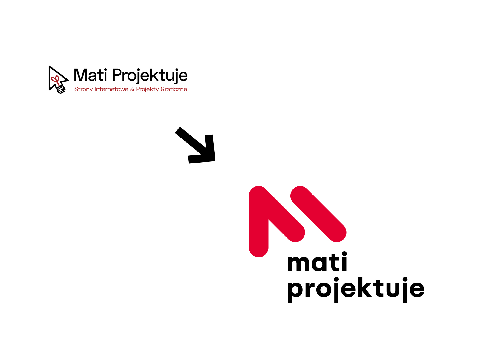
That’s why I was so thrilled when Mateusz asked me to update my logo. He set one condition: it had to have something similar to the old logo.
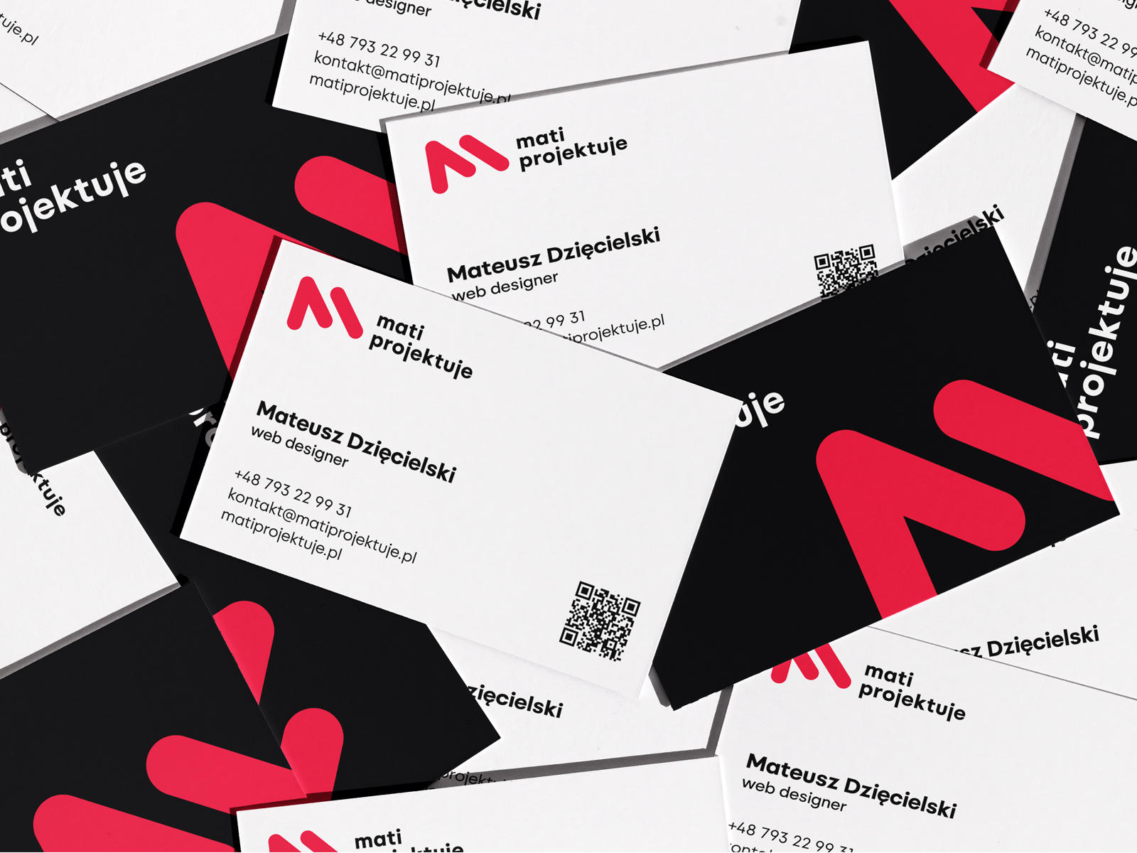
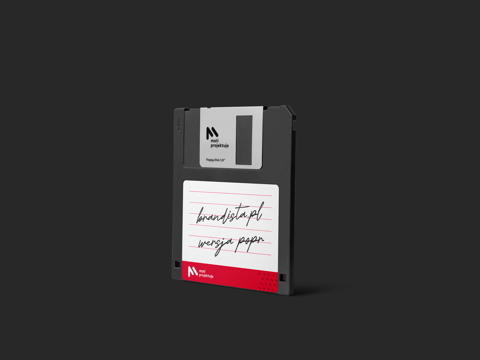
The MATI PROJEKTUJE logo is an incarnation of the previous logo, which used the image of a cursor and a light bulb, symbolically referencing ingenuity (the light bulb) in website design (the cursor).
In the new logo, I’ve omitted the light bulb symbol because MATI PROJEKTUJE has already earned an undeniable reputation as a creative designer. However, I retained (as a condition) the stylized cursor as a web design attribute and creatively incorporated the letter M as the initial of the first part of the name (MATI), which is also a diminutive of the company owner’s name.
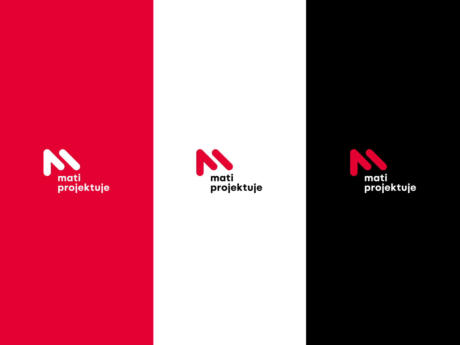
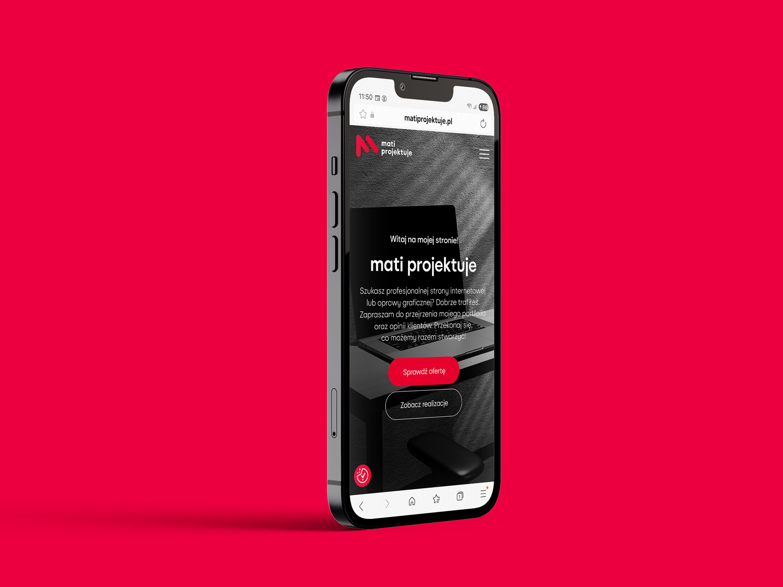
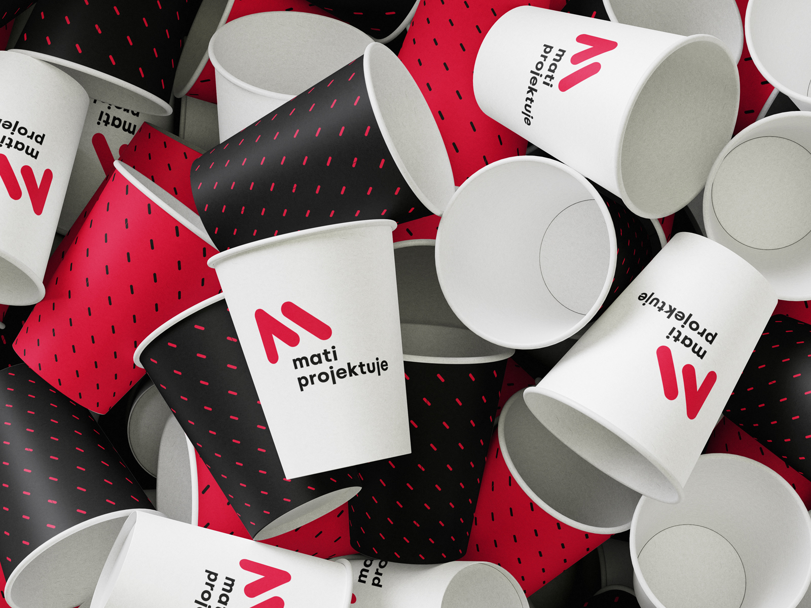
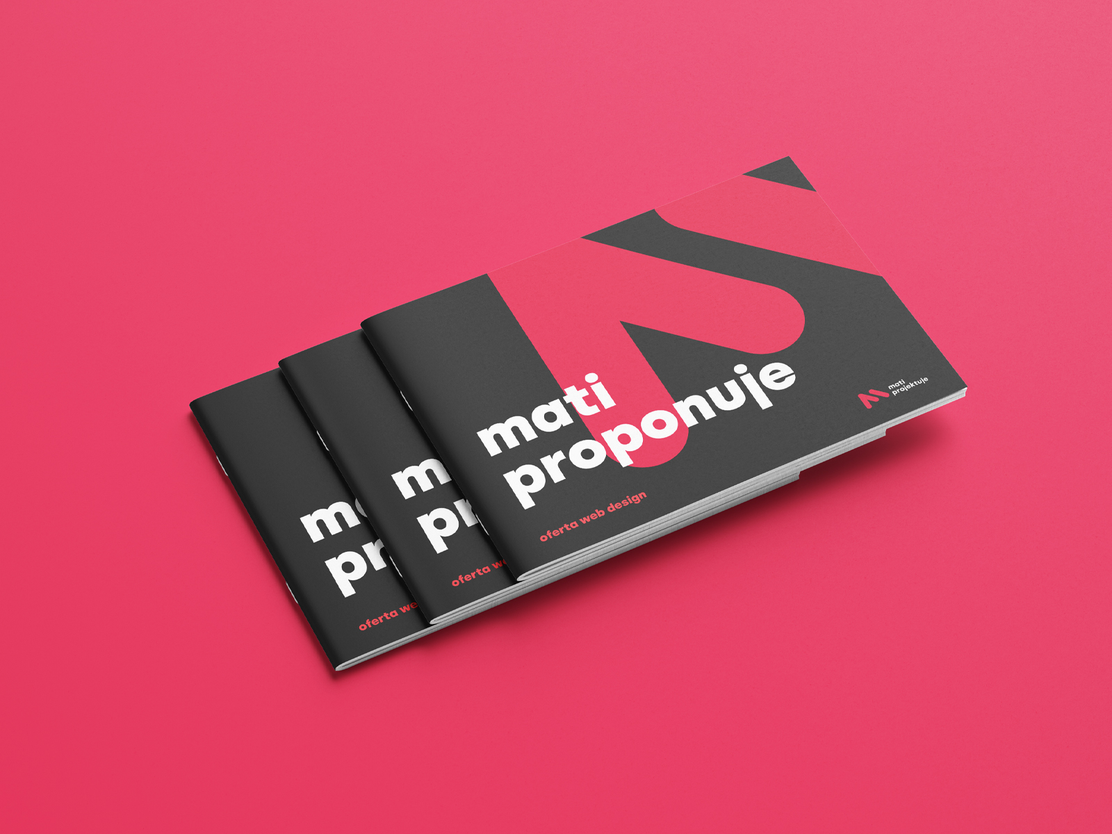
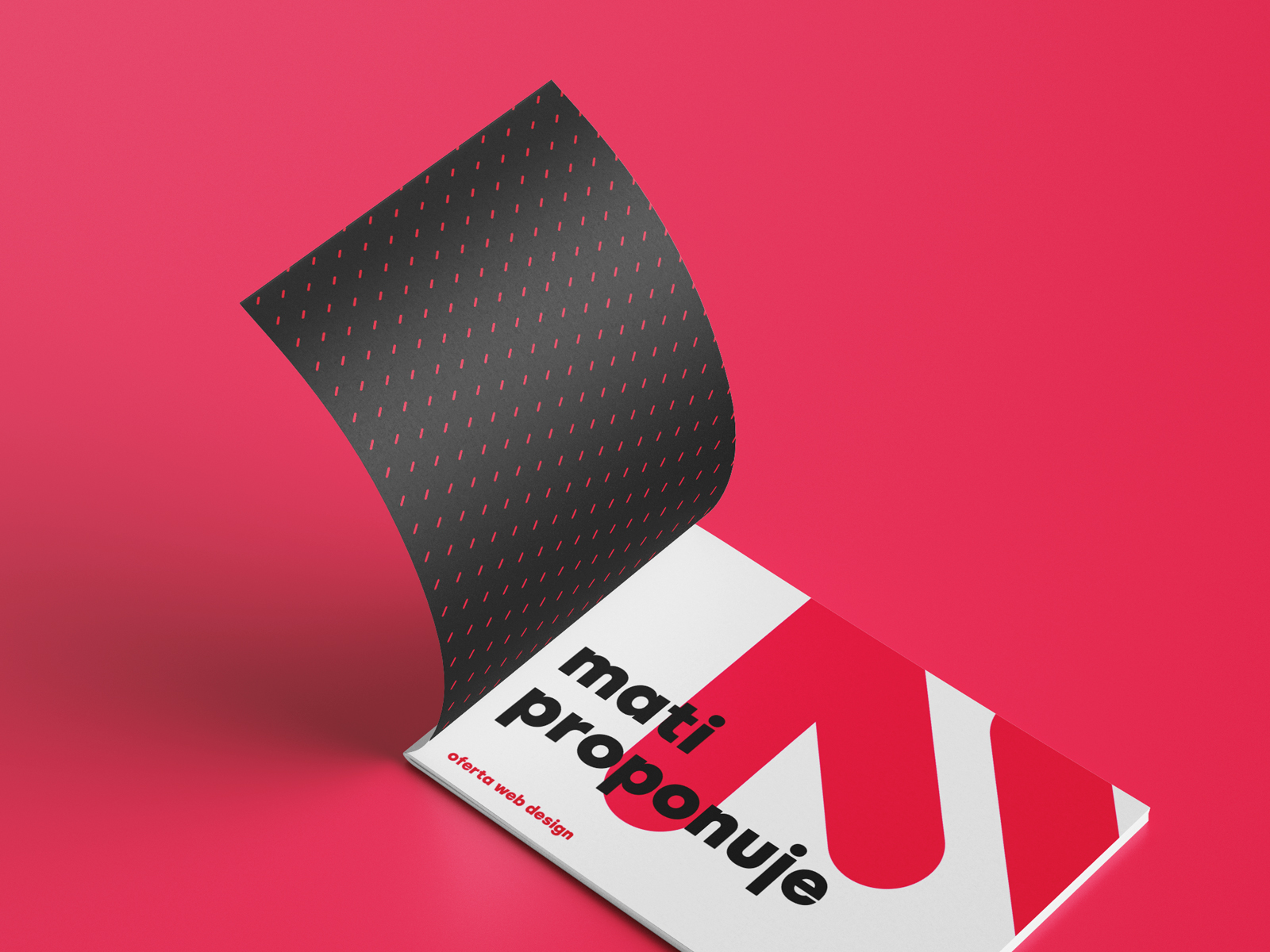
The logo was designed in a minimalist and modern style, which is well-suited to the tech industry, particularly web design. It is characterized by a lack of unnecessary elements, clean shapes, a clear message, and modern typography.
Thanks to its simplicity and clear message, the logo is eye-catching and easily memorable.
The symbol—the combination of the cursor and the letter M—is a creative brand icon that works even without a logo—it is contextual, expressive, and very distinctive.
The rounded, slanted shapes give the symbol a dynamic feel, which is associated with creativity, a dynamic design process, and an openness to new technical solutions and design trends.
Mateusz expects the new logo to increase his sales by 1000% 🙂 And that’s what I wish him with all my heart.